

https://parkirussia.ru
Often clients come with such a problem: there is a great idea, and sometimes even a project, but there is no understanding of how it should look.
And no matter how beloved the clien is, such projects are always a pain, because in a week you need to study the business, conduct research, create an identity, logo, roll out a design concept, design merch, design a spaceship and fly to the moon. Someone refuses this, because, naturally, such projects take a lot of time and effort.
But we are not at all afraid to take on projects that need to be designed from scratch, because in addition to freedom of action, we have the opportunity to make a greater contribution to the client's project.
Next, we will tell you how to work with such projects and to make a great design that works.
Step 1. Meeting
In August, we received a request to develop the Parks of Russia website - a team from Izhevsk launched a federal-level project to develop and create parks, public spaces and domestic tourism throughout the country.
The client came to us on a recommendation, but he was quite strict in his requirements, very limited in time for communication with the Business Culture team and with “hot” deadlines for the implementation of the site. At the meeting, we asked him to talk about the project, its history, development strategy, its place in the market, target audience, intended use, list the main competitors, and so on. For their part, they presented their work, talked about the competencies and the process of working on the project.
We always try to meet with the client, to see his face. It doesn’t matter if it’s an offline meeting or a zoom call, the main thing at this stage is to build communication and your empathy. This applies to new clients, and to those who came by acquaintance or recommendation. This is how we increase the degree of trust, remove most of the questions and concerns and show our expertise.
So, the meeting is over, but it's too early to draw the layouts, the next steps are to consider what the client said, give yourself time to feel his position, and move on to the next step.
Step 2. Benchmarking
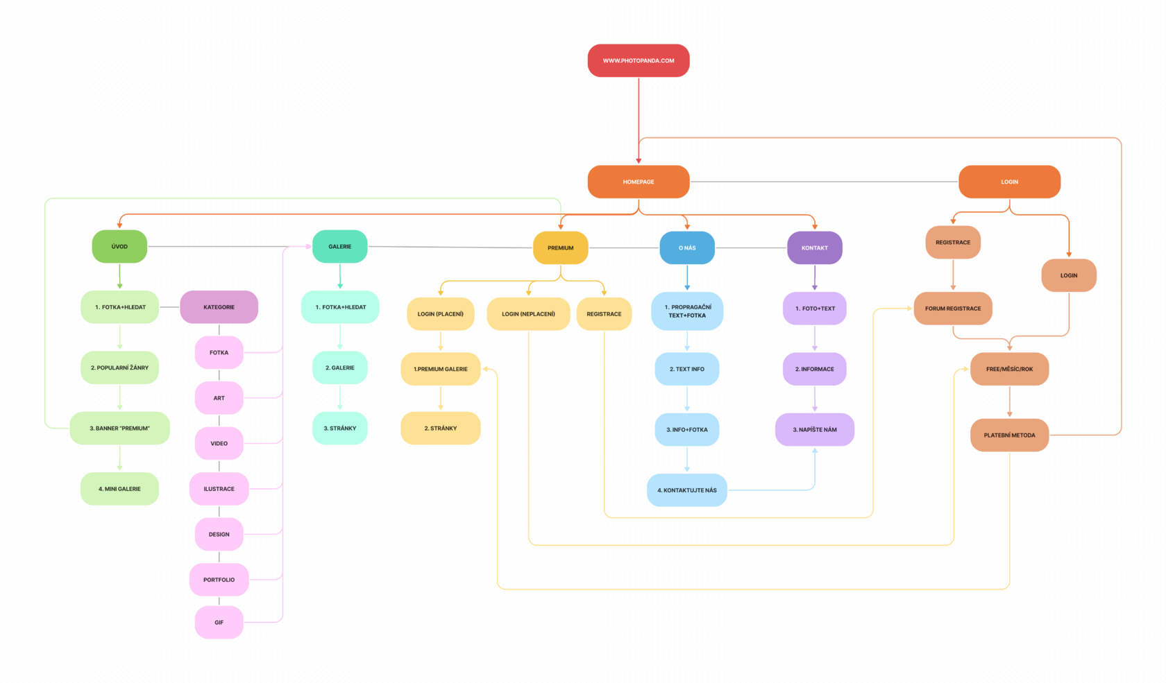
Projects from scratch require special attention. At this stage, we collect as much information as possible for research, analyze the best players in the market, competitors, identify stakeholders and consider user scenarios. At this stage, we are helped by the methods of persons, CJM, JTBD. In the case of Parks of Russia, we chose the last method: JTBD, because it was critical for us to determine what users would visit the site for and what they want to achieve, and not how they overcome difficulties on similar sites.
After working through JTBD, we compiled the final version of the site architecture, worked out possible scenarios and moved on to the page structure.
After working through JTBD, we compiled the final version of the site architecture, worked out possible scenarios and moved on to the page structure.
Step 3. Prototypes
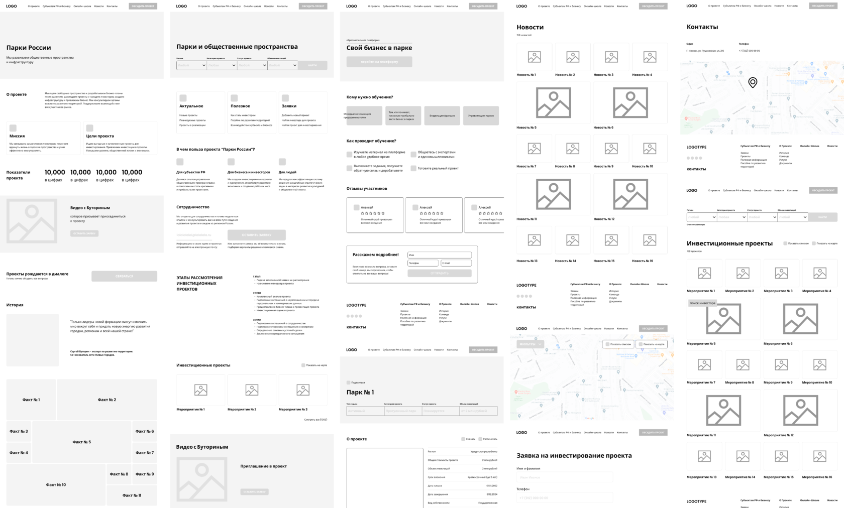
Based on the site architecture, scenarios and analysis of market players, we developed a prototype of each page and linked them into scenarios to show the client the logic and way of thinking of the user.
We always make prototypes as simple as possible, do not use color and images, so that nothing distracts from the structure and arrangement of elements on the layout during the client’s approval process.
After agreeing (at this stage, we did without edits), the client got an understanding of what he wants to get from the site, and why he needs it. To avoid unnecessary changes and save time, it was decided to draw up a clear technical specifications and fix the already agreed stages.
Step 4. Design-concept
In working with Parks of Russia, we were given complete freedom, however, in order to decide what the design will be, we decided to rely on the tasks that need to be solved and the tone of voice that the project leader sets.
Tasks we needed to solve:
- reflect the spirit of the company and its USP;
- reflect the scope and segment of the business;
- create a visual that is in line with general trends, without quickly becoming obsolete due to frequent trend changes;
- to reflect in style the association with large investment projects and the public sector.
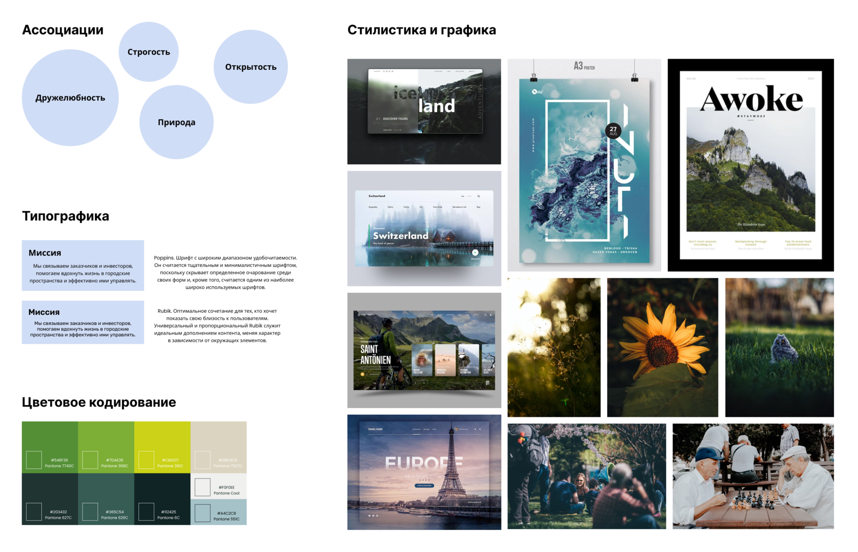
Tone of voice of the future site:
"Conciseness", "clearness", "freshness". These adjectives had to organically fit the display of investment projects, the sale of places for training, the image. This is what we took into account when developing a new concept, which was supposed to reflect the scope, scale of the business and the spirit of the company.
"Conciseness", "clearness", "freshness". These adjectives had to organically fit the display of investment projects, the sale of places for training, the image. This is what we took into account when developing a new concept, which was supposed to reflect the scope, scale of the business and the spirit of the company.
Preparation and search for solutions
The client's business is quite specific: on the one hand, it is necessary to show the field of activity and large investment projects, on the other hand, the design should not be similar to the websites of the financial and technical sector.
Therefore, we decided to conduct another interview with the leader of the company in order to delve deeper into his vision. During this interview, we already deeply asked about the Parks of Russia project, what it should be like, what feelings and emotions to evoke, asked to describe it from all sides.
Based on the responses, the following conclusions were drawn:
These theses have become reference points in our design concept.
The client's business is quite specific: on the one hand, it is necessary to show the field of activity and large investment projects, on the other hand, the design should not be similar to the websites of the financial and technical sector.
Therefore, we decided to conduct another interview with the leader of the company in order to delve deeper into his vision. During this interview, we already deeply asked about the Parks of Russia project, what it should be like, what feelings and emotions to evoke, asked to describe it from all sides.
Based on the responses, the following conclusions were drawn:
- it is important for the client to show the scale of the entire business - he is the market leader, always one step ahead of his competitors;
- The company leads an active lifestyle. It is dynamic, developing, modern - about people, communication, comfort and stability;
- the company is proud of its deep expertise – knowledge and ability to install and develop a modern and efficient public space in any place.
These theses have become reference points in our design concept.
UX/UI audit
Next, we analyzed the sites of competitors in the field of tourism and investment from the point of view of visual solutions and identified the following points of growth: many do not pay due attention to visual design - sites have not been updated for a long time, non-obvious graphics or lack thereof, inappropriate images on the main screens of many sites, which confuses confusing and pushes to the idea that these are sites of tour operators.
Also, there is no adaptive layout, the rules of external-internal are not observed, there is little air, problems with typography are obvious.
The “About” section has a solid text that is difficult to read.
The catalog does not contain the actual functionality that is used today to simplify usability (for example: ordered lists, filtering by category, sorting by important qualities - price, new, popular).
The design looks noisy and not relevant.
Hypothesis
Such companies are usually on the market for a long time. They have a stable portfolio of clients, so there is no need for a redesign.
It was important for our client to use the site to scale the business, increase awareness and increase sales. Therefore, we based our redesign concept on the components of a high-quality UX / UI site:
- Easy navigation, menu structure;
- developed design system;
- a clear Home page that reveals the activities of the business and its advantages over competitors;
- clear directory structure with thoughtful sorting and filtering;
- project cards with a precise description of the characteristics.
Searching for references
We didn’t limit ourselves to the customer’s business at the concept development stage, so we looked at sites and cases of completely different areas. This approach helps to identify current design trends and identify the best solutions to adapt them to your own project.
We didn’t limit ourselves to the customer’s business at the concept development stage, so we looked at sites and cases of completely different areas. This approach helps to identify current design trends and identify the best solutions to adapt them to your own project.
Creation of a design concept
An important factor in the organization of work on this project is the limited time frame. We had to develop and defend the concept in 4 days. So we did a 15-minute brainstorming session, picked out the best ideas, and started painting.
3 components of a good UI
Composition, typography, color.
We worked out a clear structure - sections and blocks were arranged in order of importance for the user. This makes the site easy to navigate. We added a lot of air, provided for the correct placement of visual accents - the logo harmoniously combines with other elements - buttons and graphic elements. We discarded all unnecessary elements so that site visitors would not be distracted from passing through the scenarios we had conceived. We chose a clear, bright and large sans-serif font for easy readability. We used a color scheme that is reminiscent of nature, but does not draw the focus on itself, but neatly complements the content.
We worked out a clear structure - sections and blocks were arranged in order of importance for the user. This makes the site easy to navigate. We added a lot of air, provided for the correct placement of visual accents - the logo harmoniously combines with other elements - buttons and graphic elements. We discarded all unnecessary elements so that site visitors would not be distracted from passing through the scenarios we had conceived. We chose a clear, bright and large sans-serif font for easy readability. We used a color scheme that is reminiscent of nature, but does not draw the focus on itself, but neatly complements the content.
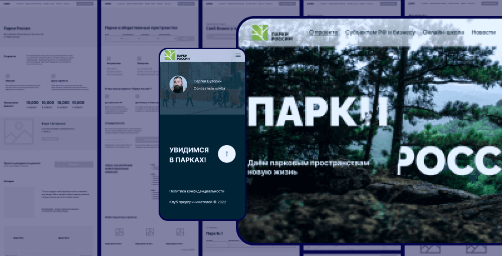
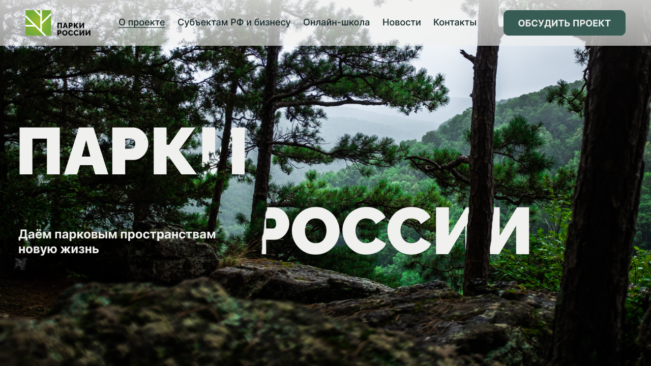
First screen
We selected high-quality and bright images for the main screen and inscribed the slogan of the company and the main directions of its activity into the environment, thus we reflected the main idea of the project: any actions to create public spaces do not affect nature, but fit into it in an environmentally friendly manner, maintaining a balance between comfort visitors and the preservation of natural objects.
We selected high-quality and bright images for the main screen and inscribed the slogan of the company and the main directions of its activity into the environment, thus we reflected the main idea of the project: any actions to create public spaces do not affect nature, but fit into it in an environmentally friendly manner, maintaining a balance between comfort visitors and the preservation of natural objects.
Investment projects
In the next block, you can learn more about investment project cards. It was important to draw attention to the study of this block, to make reading the information easy. The obvious problem of such blocks is the different style of images, the abundance of information, unnecessary filters. Therefore, we decided to apply the familiar spot format to it, so as not to strain users, and reduce the number of filters, leaving only the most necessary ones.
In the next block, you can learn more about investment project cards. It was important to draw attention to the study of this block, to make reading the information easy. The obvious problem of such blocks is the different style of images, the abundance of information, unnecessary filters. Therefore, we decided to apply the familiar spot format to it, so as not to strain users, and reduce the number of filters, leaving only the most necessary ones.

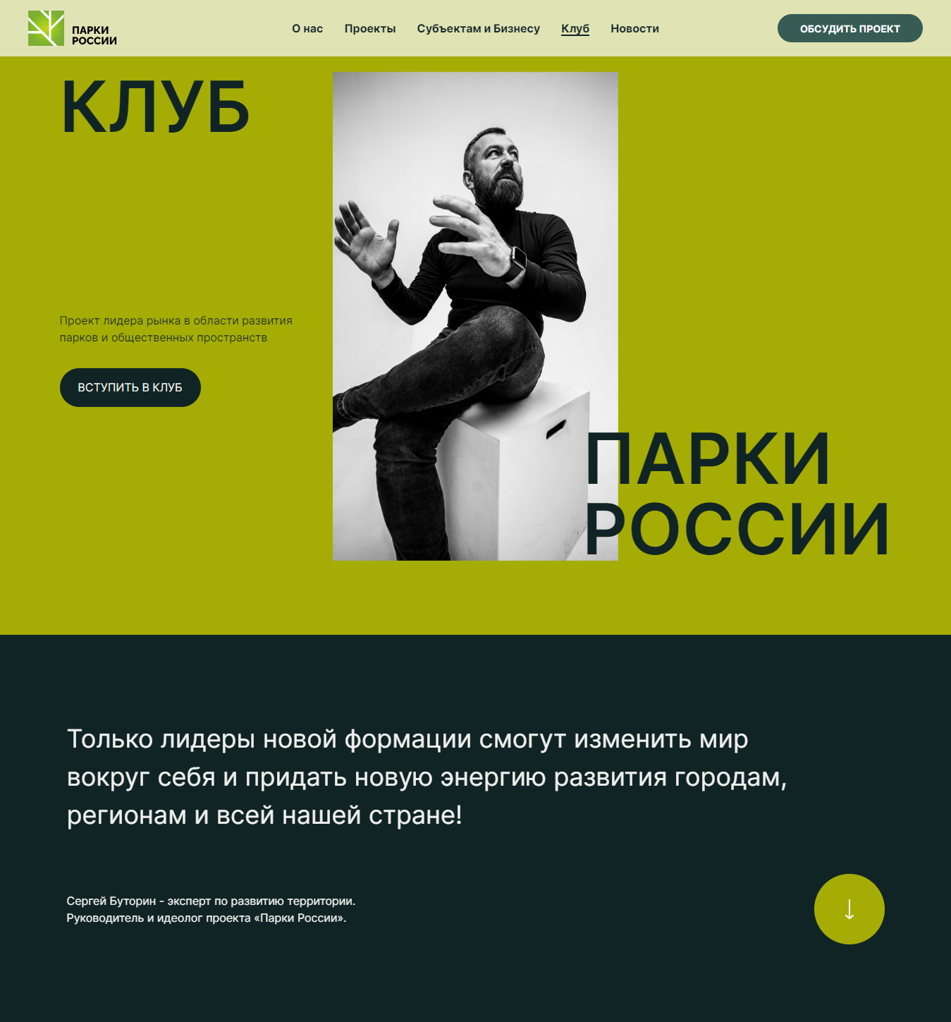
Personal brand
In order to emphasize the image of the company and its leader, we created a separate page in a bolder color scheme, structured the text and USP, filled it with images that are associated with a modern and bright leader.
In order to emphasize the image of the company and its leader, we created a separate page in a bolder color scheme, structured the text and USP, filled it with images that are associated with a modern and bright leader.
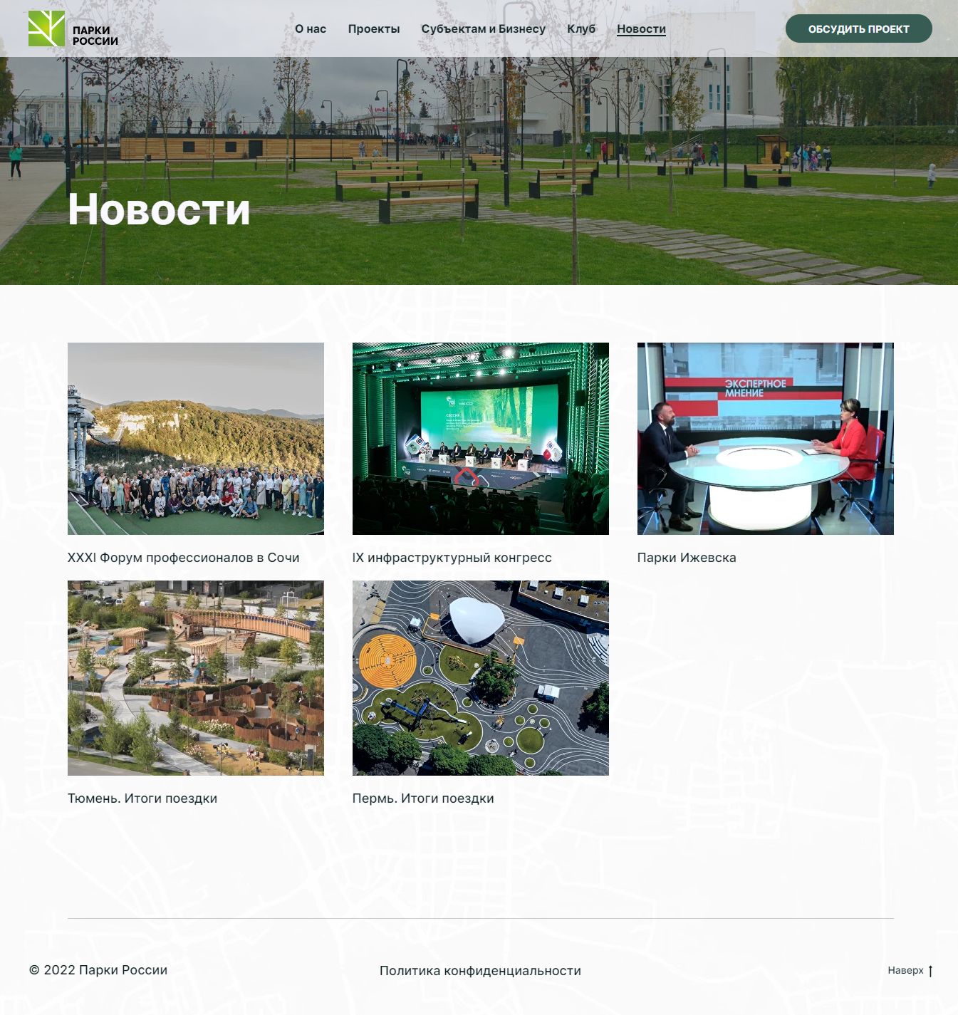
News
The customer asked to place a news block on the Main. We supported the style of previous blocks with a strict layout and fresh colors.
The customer asked to place a news block on the Main. We supported the style of previous blocks with a strict layout and fresh colors.
Project life after design
We approved the concept, received the content, made a full-fledged design. It seemed that all that remained was to make it up.
But on the Parks of Russia project, we had to go from buying a domain to setting up seo and sending emails.
This project sunk into our souls, we wanted to help the client solve all the problems, so we took full responsibility, and of all the possible technical settings, only the connection of the payment system remained unfinished, since the site does not provide for payments.
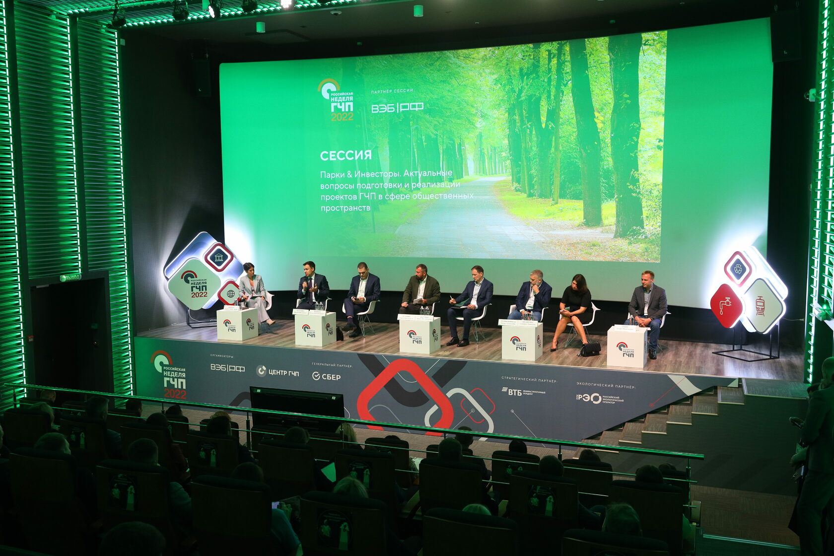
A pleasant conclusion to this project was the presentation at the forum “IX Infrastructure Congress. Russian PPP Week 2022” and high conversion.
We approved the concept, received the content, made a full-fledged design. It seemed that all that remained was to make it up.
But on the Parks of Russia project, we had to go from buying a domain to setting up seo and sending emails.
This project sunk into our souls, we wanted to help the client solve all the problems, so we took full responsibility, and of all the possible technical settings, only the connection of the payment system remained unfinished, since the site does not provide for payments.
A pleasant conclusion to this project was the presentation at the forum “IX Infrastructure Congress. Russian PPP Week 2022” and high conversion.
Results
We tried to make a simple and understandable design concept that carries business value, and the interface creates the right impression of the company's activities, deep expertise and status level in the market.
This is the case we have. If you want us to make a high-quality design concept for you, leave a request at office@businessculture.ru.
This is the case we have. If you want us to make a high-quality design concept for you, leave a request at office@businessculture.ru.


